
A fix for the annoying line below the Main Navigation in publishing sites

There are some things in SharePoint that you just have to take a second to shake your head in disbelief on why it was built that way. In most cases if you have been working with SharePoint as long as I have your perception on what is normal is a little skewed... To this point on many of my designs I have worked around this little gem. In most cases it does not effect the designs or I could create a simple fix for it.

One of the functions of a publishing site the is not available for a WSS site is the  "Page Editing Toolbar".

image

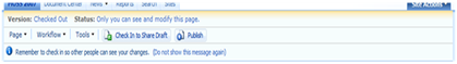
This toolbar is only suppose to be visible if you either click on Site Actions > Edit page, or Site Actions > Show Page Editing Toolbar. This is technically not the case. If you look at the screenshot below you will see that there is a 1px high by 100% wide background color of #79a7e3 from the toolbar showing through into the design in normal mode: Normally you would think this would be a border bottom to the main navigation but it is not.

imageWhat I normally do is to take that "ms-consolemptablerow" class and just change the background color from #79a7e3 to "transparent".

This is especially important for designs that are very simple and do not need that extra line below the navigation.

image

Once you use the following css, the line will be removed.

.ms-consolemptablerow{
background-color: transparent;
}

You might ask yourself well how will this look if I edit the page and show the toolbar? Well this is where you start scratching your head... It actually is hidden from view when the toolbar is visible...

Try it for yourself, make the background red and view the page in non-edit mode, and then either view the toolbar or edit the page and see what happens... Its gone like Magic.

BG Red (Non Edit Page) BG Red (Edit Page)
image image

Go figure...

Comments

Unknown said…
Great Blog :)
You are in my RSS Feed now ;)
Anonymous said…
Much appreciated, was looking for days for explanation for this line that suddenly appeared.

Couldn't find what Console css style I had changed (as was not there for long period after master pages setup).

Worked immediately :)
Anonymous said…
It doesn't work for me! Instead of being transparent the line gets from blue to white!
Can anybody help please?

Thanks Cedric

Popular posts from this blog

How To: Create Hyperlink to Modal Pop-Up Form

I was asked by a client recently if there was a way to create a hyperlink to a New Item Form anywhere within a site but still get the rich experience of the Modal pop-up window that grays out the background. (Note this is for SharePoint 2010 Only…) I basically took the code directly from the “Add new item” and the “Add Document” link within the list view. What this allows you to do is simply add in the following code to any content editor web part, Master page, or Page Layout in any site collection and display the form to be filled out. The user will get the nice experience of the modal window and not have to navigate away from their current page. This could be used for example a feedback form that is included in the master page so whenever someone wants to give feedback it is always going back to a central list. The only that is required for you to know is the List ID and the site name. Full Code For a List Item: <a onclick="javascript:NewItem2(event, &quot

SharePoint 2010 Base CSS Classes

This will be the first of many SharePoint 2010 posts. I will be focusing on a few of the main CSS classes used for SharePoint 2010 Public Beta. As the product becomes more final there might be some changes to the class names but I will be sure to create a new post if that happens. This will be quite a lengthy but it should be helpful. The default CSS given below are just highlights of the full CSS attributes for that class. I will be using a basic team site as my base for the screenshots. Here is a basic structure of the main areas that I will cover. Ribbon Row Table Row Left Site Actions Navigate Up Edit Tab List Browse Page Table Row Right Give Feedback Welcome Menu Workspace Body Container Title Row Title

SharePoint 2013 Responsive Table Columns

I have been wanting to write this one for a while now. It is really amazing how UX is really finding is way into everything that we use and interact with. From Custom applications both mobile and on a desktop to document management or large data visualizations. There is always room for better usability and new concepts. SharePoint lists and library functionality really has not changed much for the past 10 years... I remember back in 2003 when I saw the same table/grid based views of documents and list items that exists in SharePoint 2013. But now we can look at them in a whole new way! In this video blog you will see how to create a responsive CSS table so that when the browser size is reduced it will hide specific columns. However hiding data is not always the right thing to do. What if a user needed those columns to filter on or to use for comparison to another document? Well that is where the custom jQuery Column chooser comes in. It allows you to see what columns are displ