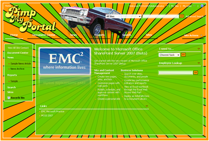
As part of our normal delivery on branding projects we usually supply a SharePoint style guide. This document is intended to be used by site owners/developers to support the branding once the project is complete. I have created many variations of this type of document, What I find really helpful for the consumers of this document is to provide some of the following:
Branding Requirements: Example
| # | Properties |
| 1 | Branding will be applied at the site collection level |
| 2 | Any Changes to branding (CSS, Images) will automatically get updated to the site. Admin will not have to force or re-apply styles |
| 3 | When a sub-site is created, it will automatically have branding applied. |
| 4 | All _layout application pages will have branding as well. |
As we all know there are many ways to add lipstick to the pig, so what I would suggest is to add the following as well: Make sure you work closely with the site owner and educate them on the pro's and Con's of each method.
Write in the implementation method related to those Requirements and how they will be met: Example
| Requirement # Met | Approach | Known Issues |
| 2, 3, 4 | Modify Core Server CSS File: | This will be applied to all sites, sub-sites, application pages, and My Sites. However if another application needs to have their own branding it will have to override the custom CSS. All default files will need to be backed up in case of service pack updates or upgrades. *For the first release this would be recommended as the best method. |
| 2, 3, 4 | Modify All Core Server Master Pages: | Same as modify core CSS file. (This approach is not a best practice) |
| 2, 3 | Modify Server Default.Master: | This will not modify the system pages located in the _layouts pages. |
| 1, 2, 3, 4* | Custom Site Definitions and Ref. Alternate Style sheet: | This method meets all of the required elements but the following is a known issue *The Alternate Style sheet will have to be applied to every top level site collection and not all system pages will be branded… |
| 1, 2, 3 | Custom Site Definitions | This method will not brand system pages. |
| 1, 2, 4 | Custom Master Page within UI and Ref. Alternate Style sheet: | This approach is the most flexible and is the best practice for brand implementations per site collection. However the custom master page will have to be uploaded and applied for every site collection. When new WSS sites are created the brand will not be applied automatically |
| 1, 2 | Custom Master Page within UI | This approach will not touch any system pages. |
| 4 | Custom Theme | This approach is defined per site and cannot be pushed across all sites. If design is modified it will not be visible until an IISREST and the theme is removed and then applied again. |
| 1, 2, 4 | Alternate Style Sheet | This approach does not get applied when a new site is created. |
The last but really useful thing that I started to add to my Style Guide and CSS is Zone Numbers and Comments.
I will use my personal favorite design that I have created as an example: Pimp My Portal... 
Zone 1:
| Preview | Main Classes |
| .ms-globalbreadcrumb | |
| .ms-globallinks, .ms-globallinks a |
Zone 2:
| Preview | Main Classes |
| .ms-globalTitleArea | |
| td.ms-titleimagearea | |
| #SRSB |
In the Alt. Style sheet I would provide the following comments to match up the zones: This allows an easy way to find the modified classes.
/* Zone 1: Top Navigation Styles */
.ms-globalbreadcrumb{
background-image:none !important;
background-color:transparent !important;
border-bottom: 0px #2d5696 solid;
padding:3px 10px 0px 10px;
}
/* Zone 2: Global Title Area */
.ms-globalTitleArea{
text-align:right;
background-image:none;
background-position:right top;
background-repeat:no-repeat;
background-color: transparent;
height: 63px;
padding-left:10px;
padding-right:0px;
padding-top:1px;
}
/* Zone 2: Search box Positioning */
#SRSB{
padding-top: 15px;
}
Some of the other parts of the SharePoint Branding Style Guide would include:
- Approved Logos
- Approved Corporate Color Palette
- Image and CSS Locations
- Installations Instructions
- List of Modified Images
Comments
I was wondering if you could tell me what the top 5 design no nos would be for SharePoint master pages- from a technical implementation point of view. For example- banners running down the right hand side of the page etc. SharePoint does seem to have its limitations in master page branding.
thanks