CSS, Master Pages and Layouts Oh My...

Master Pages, Page Layouts, and CSS are the building blocks of SharePoint. Understanding the In's and Out's of all of these might require a Master's degree. But don't worry we have tools to make this process allot easier.
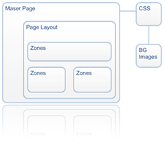
image I guess you could think of SharePoint as a house. To build this house, we need to start with a foundation (Master Page).

As we start building we plan out the different rooms in the house and the layout (Page Layouts).

Finally once we get the plumbing and electrical in (Controls/Webparts) we take out the paint brushes and start designing the look and feel.(CSS)

Within the Master Page's Head is where the default CSS file is referenced. <SharePoint:CssLink runat="server"/> also within the master page is where main content placeholder is referenced. This main content placeholder is the Page Layout for publishing sites.

<asp:ContentPlaceHolder id="PlaceHolderMain" runat="server">
</asp:ContentPlaceHolder>

Within the Master Page the primary CSS classes are defined. However since content and user controls are defined in here as well some of the classes that make up that control are defined outside of this master page. This becomes important when you are creating your own custom classes to be used in a alternate style sheet.

You can now add in your own HTML and javascript but be careful not to delete any required control that is needed to build the page.

Once you have your alternate CSS file referenced, in the head of the master page:
<SharePoint:CssRegistration name="<% $SPUrl:~SiteCollection/Style Library/custom.css%>" runat="server"/>
you can add in your custom classes and referenced the Background images within those classes.

The page layouts get a little tricky but with SharePoint Designer it gives your some helpful drop downs and intellisense to help make new zones and other controls easier.

I am not saying that you will be able to go out and build a Million dollar home in your first try. But if you are just starting out, I would recommend that your start small, possibly a doll house or a garden shed. Make sure that you do this in a development environment and not your production boxes.

< Best of luck and happy coding! />

Comments

magnus said…
Hello,
How would I add larger spacing/margin between the web parts using CSS?

Is this done by modifying zones? page layouts? master page?

Popular posts from this blog

SharePoint 2010 Base CSS Classes

This will be the first of many SharePoint 2010 posts. I will be focusing on a few of the main CSS classes used for SharePoint 2010 Public Beta. As the product becomes more final there might be some changes to the class names but I will be sure to create a new post if that happens. This will be quite a lengthy but it should be helpful. The default CSS given below are just highlights of the full CSS attributes for that class. I will be using a basic team site as my base for the screenshots. Here is a basic structure of the main areas that I will cover. Ribbon Row Table Row Left Site Actions Navigate Up Edit Tab List Browse Page Table Row Right Give Feedback Welcome Menu Workspace Body Container Title Row Title

SharePoint 2010 Content Query for Blog Posts

I hope this post will help many of you feel comfortable with using the Content Query Web Part. In this post I will walk you through the process of creating a content query web part and configuring it to show custom field types. I will also give details on how to use XSLT to stylize and format the data being pulled. I will be using the following scenario as an example. Say that you had a site collection with a top level publishing site. This publishing site would display a the most recent blog posts from all blog sites within its own site collection. To solve this problem we will use a Content Query Web Part and a customized ItemStyle.xsl using XSLT. Please note that the “SharePoint Server Publishing Infrastructure” needs to be enabled at the site collection to display the content query web part. Step 1: Add a Content Query Web Part to Page Navigate to the site that you want the blog posts to show up and click on edit page. Under Editing Tools in the Ribbon, Click on

SharePoint 2013 Responsive Table Columns

I have been wanting to write this one for a while now. It is really amazing how UX is really finding is way into everything that we use and interact with. From Custom applications both mobile and on a desktop to document management or large data visualizations. There is always room for better usability and new concepts. SharePoint lists and library functionality really has not changed much for the past 10 years... I remember back in 2003 when I saw the same table/grid based views of documents and list items that exists in SharePoint 2013. But now we can look at them in a whole new way! In this video blog you will see how to create a responsive CSS table so that when the browser size is reduced it will hide specific columns. However hiding data is not always the right thing to do. What if a user needed those columns to filter on or to use for comparison to another document? Well that is where the custom jQuery Column chooser comes in. It allows you to see what columns are displ