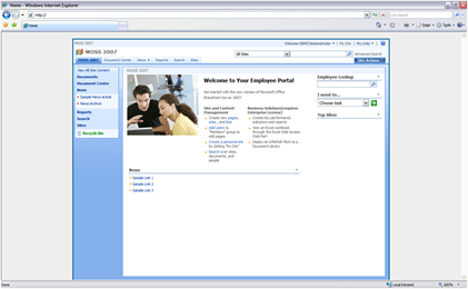
If you have ever had the task of creating a SharePoint Design with a fixed width that is centered on the page here is a post that might help you. (Sorry about the length...)
In your alternate stylesheet add the following classes and properties:
body{
background-color:#EEE;
font-family:verdana,arial,helvetica,sans-serif;
color:#000;
text-align: center;
padding-top: 20px;
}
.ms-main{
width: 980px;
border: 3px #006699 solid;
border-bottom: 0px #0066699 solid;
background-color:#FFF;
}
#mainTable{
width: 100%;
}
Here is an example of what the results of the code above would look like:
Simplified HTML from OOTB SharePoint
<HTML>
<HEAD>
</HEAD>
<BODY>
<form>
<TABLE class="ms-main">
</TABLE>
</form>
</BODY>
</HTML>
Basically if you look at the the simplified SharePoint's html and Classes above you will notice we are simply applying a light background color, Top Padding, and Text-Aligning property to the <Body> tag. This helps center the site, and brand it as a container.
As for the "ms-main" class we are setting the width of the site to be 980px (you can set this to what ever you like but If majority of your users are all 1024x768 or above I would recommend using this size.) I have also added in a border to help contain the site and a background color of white, so when classes that do not have a background color specified do not show the gray <body> background.
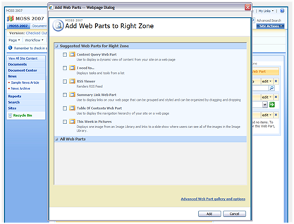
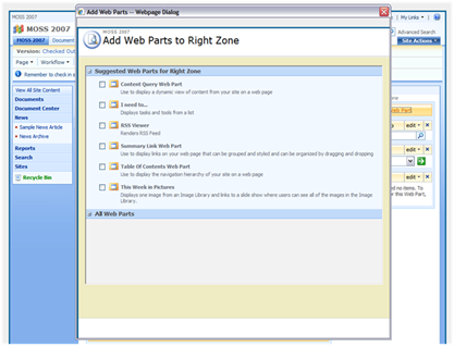
The reason why I needed to add the #mainTable class with a width of 100% is that there is a issue with the Web part picker that when you click on Add a Web Part it uses the class of ms-main and since that class now has a fixed width it does not display properly. See screenshot below: Notice you cannot see the "advanced web part gallery and options link or the ADD, and Cancel Buttons... To see them you have to expand the window. (Not a good experience for your users)
So by using the #mainTable class properties above to set the width to 100% you get the correct display of the Web Part Picker.
 I guess the way the webpart picker works is that there is a masterpage that lives in the "C:\Program Files\Common Files\Microsoft Shared\web server extensions\12\TEMPLATE\LAYOUTS" directory called "pickerdialog.master" and in this master page there is the following html:
<TABLE class="ms-main" CELLPADDING=0 CELLSPACING=0 BORDER=0 WIDTH="100%" HEIGHT="100%" id="mainTable">
I have simply taken the ID of that table to fix the issue with webpart picker. The reason why this works is that on the default masterpage this ID is not present.
If you dive deeper into the file there is a content place holder called: <asp:ContentPlaceHolder id="PlaceHolderDialogBodySection" runat="server"/>
The file that defines this Content Control is located in the same directory called "webpartgallerypickerpage.aspx". This page has the classes that define the look and feel of the Webpart selection but not the outside container of the picker. The outside shell is controlled by the Master page listed above.
Sorry about the rant on the Picker but it is very important to know about how classes are shared across many different types of pages. That is why it is always a really good idea to make sure you dedicate enough time for testing!


Comments
text-align: center;
The property in the body tag "text-align: center;" is not used to center the text but to center the "ms-main" class AKA the site container. If this was not specified the site would be left justified by default. So this is a key property to have in the body tag if you want your site to be center justified.
Does that help?
The only thing I noticed with the example CSS given is that the 20px padding at the top of the page also pads the editing windows 20px at the top (for example, editing a link in the modify navigation page), pushing the OK and Cancel buttons halfway out of view.
Thanks again!
i wanna ask something about this sharepoint 2007...
i have been working out transition photo matters, and until now i didn't find transition effect for photo....
any idea for fix transition photo effect in MOSS 2007
Only one issue is that is 2 of my site landing pages, the width is getting overridden (believe due to a couple of announcement lists :( any idea on how to force that!!
Please help to fixed this issue
Thanks
themes.css (or) mossextension.css (or) core.css?
clipping path service company