I started out my career creating custom forms, stationary, and illustrations/diagrams for a book publishing company.  You can see my old illustration art here: http://www.noreastdesign.com/erik/*Keep in mind this was last modified back in 2004, so the resume is way out dated...*
Back in 2004 I was working exclusively on a MAC. So when clients (Book Authors) sent us Visio files, we would cringe because all we saw was very rough boxes and squares.
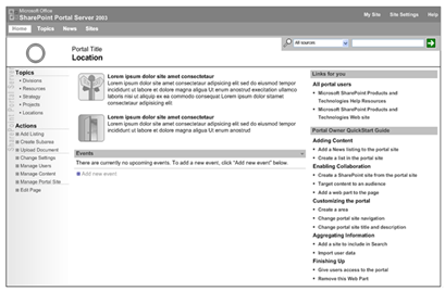
As my career changed to consulting, and my PowerBook laptop turned into a Dell Latitude, I started looking at Visio a little closer. After being given a task to take screenshots and re-draw all SPS 2003 default pages and admin screens in Visio(~70 screens) I started seeing that this application could really be more than boxes and squares.
So I put down my Illustrator, Freehand, and other vector programs and really dove deep into what Visio had to offer. I found it actually really easy to create great looking wireframes.

Example SPS2003 Home Page Wireframe created in Visio
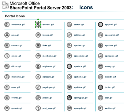
I had the ability to draw complex icons, webparts, and layouts. This was a great way to learn SharePoint and Visio at the same time since I am a very visual learner. But what do I do with it now?
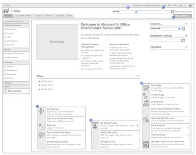
We started using this for a few projects and it was a great success. But by the time we started getting other people to use it in our practice, MOSS Beta 2 was just getting released. So back to the drawing board... To learn about the new features in MOSS I whipped up a VM image, got an instance installed, and started taking screenshots and Wireframing.
This time with the intention on creating not just a documented version of SharePoint in Visio, I wanted to create a Toolkit that could be used throughout our practice for a consistent way of creating SharePoint Wireframes.

Example MOSS 2007 Home Page Wireframe created in Visio
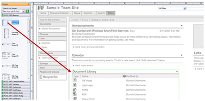
So this time I created a ~50 page toolkit that spanned from Basic Home Page, to Team Site Templates, to My Sites and all the way down to the Site Settings screens. This was a huge undertaking but once finished, I had created a tool that someone could simply drag and drop Webpart Shapes such as document libraries, Issues Lists, Announcement lists, Etc right onto the page.
By creating a consistent way of creating wireframes it is now easier for my group to create and share new layouts, templates, webparts without worrying about how to convert an Illustrator, Fireworks, or PPT template for re-use.
I am not saying that Visio is Holy Grail of Wireframing applications. There are some tools such as Omnigraffle that do a good job as well, but since Visio is part of the Office Suite, its easier for people to get a copy and install it.
So I encourage you all when the next SharePoint version is released, go out and create your own SharePoint wireframes in Visio you might just hit two birds with one stone.
** Update **
I know you are thinking to yourself, great cool, when and how can I get it.. I really wish I could share it, but since this is a document that was created in-house (EMC Consulting) I cannot share... I get asked this all the time at clients sites... God knows how many people have actually offered $ for it... But at the end of the day I really cannot share... SORRY for all the Hype but nothing to show.


Comments
Too bad you can't share it with us. But it's ok, I still can make wireframes with Illustrator for planning a website.
http://www.microsoft.com/en-us/download/details.aspx?id=21480