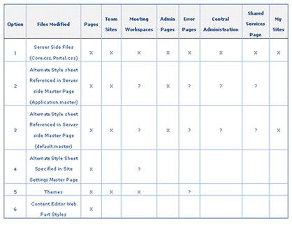
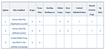
A while back I put together a quick table of branding methods and if they were applied how deep would those changes be visible.
Here are some of the ways that you can implement your branding into Share Point: going from least visible to the most.
- Content Editor Web Part Style
- Add a content Editor Web part on a page, then click on the source button and add:
Example:
- <style>
.ms-WPHeader TD{
background-color: #EEE;
border-bottom: 2px solid #000099;
}
</style>
- <style>
-
- Alternate Stylesheet:
- Configure by going to: Site Settings > Modify all site settings > Look and Feel > Master Page > Alternate CSS URL > Click on radio button "Specify a CSS file to be used by this publishing site and all sites that inherit from it." > Add in URL of alternate style
- Configure by going to: Site Settings > Modify all site settings > Look and Feel > Master Page > Alternate CSS URL > Click on radio button "Specify a CSS file to be used by this publishing site and all sites that inherit from it." > Add in URL of alternate style
- Custom Theme
- Create your own custom theme.
- Create your own custom theme.
- Adding an Alternate style sheet to a custom master page
- Upload your custom style to the server or document library.
- Within Master page <head> add the following:
- <link rel="stylesheet" type="text/css" href="/_layouts/1033/styles/customstyle.css"/>
- Adding an Alternate style sheet to the application.master Master Page.
- Upload your custom style to the server or document library.
- Within the application.master Master page <head> add the following:
- <link rel="stylesheet" type="text/css" href="/_layouts/1033/styles/customstyle.css"/>
- Overriding the Server side CSS and Images
- Not recommended for small changes, or multiple SharePoint Applications sharing the same Web Front Ends (Intranet + Extranet + Public Website)
- Styles Location on server: C:\Program Files\Common Files\Microsoft Shared\web server extensions\12\TEMPLATE\LAYOUTS\1033\STYLES
- Main Styles (core.css, portal.css)
- Images Location on server: C:\Program Files\Common Files\Microsoft Shared\web server extensions\12\TEMPLATE\IMAGES
- Over 2,050 images. (.gif, .jpg, .png)
- Over 2,050 images. (.gif, .jpg, .png)
So what is the right choice for your branding project?
The first thing you should do is consider what level of branding does your client expect, or need?
Sometimes this is hard to define, and your client might not know. See my blog post Gathering Brand Requirements: It's like pulling teeth…
General Brand Levels: Refer to your SOW and make sure you are not promising anything that would be Out of Scope!
- Brand Adaptation: Apply logo, colors only, keep out of the box layout and tab styles
- Custom brand: More design treatments, changes to lines, controls, tab styles.. stay within master page layout
- Full custom design: Change layout of master page completely.. i.e. navigation may not be in tabs, etc
Who is doing the design?
- Your Company
- By staying in house with the design we have better control over the design and keeping it to the approved brand level.
- We also know that the design is created with SharePoint in mind. More on this below
- Contractors
- Most design firms have no clue what SharePoint is and how to design against it.
- For that reason always make sure you share the designs in a internal peer review before showing it off to the client as our own.
- Clients
- Ok this one is a little tricky…
- Most large companies have marketing departments that own their corporate brand.
- In most cases they want to own the design and more often than not you can say goodbye to any creativity…
Who is doing the build?
- Your Company
- If the consultant/developer on the project does not have any experience with SharePoint CSS branding modifications than we need to find on that does!
- Contractors
- Make sure they are well trained and skilled before allowing any customizations
- Clients
- Again make sure they have the skills.
| X = Changes will be applied |
Drop a comment


Comments