SharePoint 2010: Large Search Box

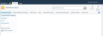
The OOTB search box in my opinion is hidden and misplaced. In most cases it gets in the way with the top navigation especially when you have a lot of items in it.

image

The solution to this problem is to move the search box up to the left of the social tags and make it bigger with CSS and Images.

image

Here is what the search box will look like: This design consists of two images one for the search box (searchbox.gif) and the other for the button (searchbutton.gif).

image

image

Moving the Search Control:
In your custom master page simply move the s4-searcharea div up into a new <td></td> before the social tags.

image

The final code should look like this: Notice that I kept the div and the “s4-rp” class. This has the “float:right” attribute for the help icon.

image

Putting it all together:
I have placed all of the support files to create this large search box style into the following .zip file that you can download and apply to your development site.

Source Files: Download HERE

How to implement:

  1. Upload the custom master page into the master page gallery
  2. Navigate to the following location on your server: “C:\Program Files\Common Files\Microsoft Shared\Web Server Extensions\14\TEMPLATE\LAYOUTS\1033\STYLES”
  3. Create a folder called “LGSEARCH” and place the “lgsearch.css” and the two image files into this directory.
  4. Apply the “lgsearch.master” to your site.

Comments

Rob Dornbush said…
Wow, this is really great Erik, thanks for sharing that solution. You are absolutely right that it is misplaced on the navigation row, what was MS thinking _ I guess they don't sympathize with us web designers who frequently need more navigational items than one can fit on that row, moving the search box up really helps!
Anonymous said…
Dear Erik Swenson,

I don't know how to implement Step 4: Apply the “lgsearch.master” to your site.

Can you tell me how to apply it?
Steve.O said…
Hi, thanks for the writeup, its always great seeing people making SharePoint look more like an actual usable product! I wrote up a similar article on the Advanced search box, and it may be useful to folks reading this. Take a look Skin/Restyle the SharePoint 2010 Advanced Search Box
Anonymous said…
Dude..seriously nice!
Rajesh R.Nair said…
Erik, you are my fav blogger on net, believe you have n number of followers .. even google suggests your blog within 5 when we search for sharepoint material.

have one request for you, could you please change width of your blog to percent 90% - now this days users are having big resolution, it will easy to read.. just my view, all your call

/r
Anonymous said…
Great Post, thanks alot
Ray S said…
Thank you for sharing! My search box is now exactly where is should have been after installing Sharepoint 2010!

Popular posts from this blog

How To: Create Hyperlink to Modal Pop-Up Form

I was asked by a client recently if there was a way to create a hyperlink to a New Item Form anywhere within a site but still get the rich experience of the Modal pop-up window that grays out the background. (Note this is for SharePoint 2010 Only…) I basically took the code directly from the “Add new item” and the “Add Document” link within the list view. What this allows you to do is simply add in the following code to any content editor web part, Master page, or Page Layout in any site collection and display the form to be filled out. The user will get the nice experience of the modal window and not have to navigate away from their current page. This could be used for example a feedback form that is included in the master page so whenever someone wants to give feedback it is always going back to a central list. The only that is required for you to know is the List ID and the site name. Full Code For a List Item: <a onclick="javascript:NewItem2(event, &quot

SharePoint 2010 Base CSS Classes

This will be the first of many SharePoint 2010 posts. I will be focusing on a few of the main CSS classes used for SharePoint 2010 Public Beta. As the product becomes more final there might be some changes to the class names but I will be sure to create a new post if that happens. This will be quite a lengthy but it should be helpful. The default CSS given below are just highlights of the full CSS attributes for that class. I will be using a basic team site as my base for the screenshots. Here is a basic structure of the main areas that I will cover. Ribbon Row Table Row Left Site Actions Navigate Up Edit Tab List Browse Page Table Row Right Give Feedback Welcome Menu Workspace Body Container Title Row Title

SharePoint 2013 Responsive Table Columns

I have been wanting to write this one for a while now. It is really amazing how UX is really finding is way into everything that we use and interact with. From Custom applications both mobile and on a desktop to document management or large data visualizations. There is always room for better usability and new concepts. SharePoint lists and library functionality really has not changed much for the past 10 years... I remember back in 2003 when I saw the same table/grid based views of documents and list items that exists in SharePoint 2013. But now we can look at them in a whole new way! In this video blog you will see how to create a responsive CSS table so that when the browser size is reduced it will hide specific columns. However hiding data is not always the right thing to do. What if a user needed those columns to filter on or to use for comparison to another document? Well that is where the custom jQuery Column chooser comes in. It allows you to see what columns are displ