Convert Folder Breadcrumb to Traditional Style

Update 11/4/2010: I found that by using the default SiteMapProviders="SPContentMapProvider" in the original post it was throwing errors when creating a publishing page.
image
So I have updated my approach below to utilize how breadcrumbs were done in MOSS 2007.

Basically you should simply replace the existing PlaceHolderTitleBreadcrumb placeholder with the following:

<div class="custom-breadcrumb">
    <asp:ContentPlaceHolder id="PlaceHolderTitleBreadcrumb" runat="server">
        <asp:SiteMapPath SiteMapProvider="SPContentMapProvider" id="ContentMap" runat="server"/>
    </asp:ContentPlaceHolder>   
</div>

I have updated the post below to reflect the above changes.

I have received a lot of feedback about the OOTB breadcrumb control for SharePoint 2010 not being useful and hard to find. People would ask me: Where did the standard breadcrumb go? I know it was there in SharePoint 2007… Well to find it in 2010 you have to look hard (Which in my opinion is not a good thing). To find it. look in the ribbon for that little folder icon with the green arrow that is next to the site actions…
image
If you click on it, it will display a pop up menu with a hierarchy from the top of that site collection.

So to get the 2007 breadcrumb look and feel back you have to do some simple configurations.

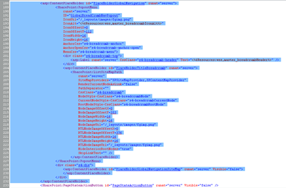
First open up your custom master page and search for: “PlaceHolderGlobalNavigation

image

Within this control there is another place holder called “PlaceHolderTitleBreadcrumb

Simply delete the “PlaceHolderGlobalNavigation” Code and add in the following simplified code right above the “s4-mainarea” DIV.

<div class="custom-breadcrumb">
    <asp:ContentPlaceHolder id="PlaceHolderTitleBreadcrumb" runat="server">
        <asp:SiteMapPath SiteMapProvider="SPContentMapProvider" id="ContentMap" runat="server"/>
    </asp:ContentPlaceHolder>   
</div>

The result should look like this: A bunch of Span and <a> tags.
image

Now it is time to add in CSS to make it look more like a traditional breadcrumb. Add in the following CSS to your global CSS file or master page:

<style>
.custom-breadcrumb{
padding:5px 0px 5px 5px;
font-family: Arial sans-serif;
font-size:8pt;
font-weight: normal;
background-color: #EEE;
border-bottom: 1px #CCC solid;
}
</style>

The breadcrumb should now look something like this:

image

You can download the sample master page HERE with the updated code above to get you started.

Enjoy!

Sorry for the changes, but I am sure you will enjoy this better without the errors!
Comments

Anonymous said…
Hi

Your article help me out lot,i have Followed the same steps mentioned by you in article, however i am not getting PathSeperator for Site Setting pages
Thanks for your Help so far.

Any kind of help will be appreciated.

Regards
Sachin
Anonymous said…
I was just getting ready to dig into this. You have saved me! Thank you for posting.

Jason
Anonymous said…
Thank you, this was just wanted I wanted to do. Keep up the awesome posts!
Erik Swenson said…
I updated the post with a better approach for adding a traditional breadcrumb in SharePoint 2010. Please review the changes and update as needed. I also updated the supplied starter master page at the end of the post.
Patrick Sledz said…
Hi Erik,

Nice post.
I am still wondering why MSFT implemented the breadcrump like this by default in SP2010?
Will try this 'workaround' in a few days :-)
Anonymous said…
I have tryed doing this method and had one problem. It worked for all of my pages except for the site setting page. The breadcrumb is in the new spot but it seems like the styles we applied are being overridden by the styles the sitemap had when it was in the folder you had to click on. Any suggestions?
Unknown said…
Hi, great post. I've followed the steps above, but I get the same issue as Anonymous. The breadcrumb in site setting pages doesn't seem to follow the new design. It uses the same design as before (in the folder you had to click on). How can I make the breadcrumb look the same on all pages? :)

Regards,
Jasmine
Hippiechos said…
Awesome, wonderful, helpful!

As said in other comments, I found that I had the same problem with the drop down look on pages and settings. I simply put the
outside of the ContentPlaceHolder, and then hid the ContentPlaceHolder (since you can't delete it without getting errors).

Thank you for the wonderful blog!
Hippiechos said…
Looks like the asp tag got taken out. My comment was supposed to say

asp:SiteMapPath SiteMapProvider="SPContentMapProvider" id="ContentMap" runat="server"

with the open and close marks
ms said…
Thank you! This helped get breadcrumb working. I have another issue, When i add portal site connection it is not added to breadcrumb is there a way to do so?
Anonymous said…
The SiteMapProvider would bring over the child nodes like default.aspx, I would change that part see http://geekswithblogs.net/leonardm/archive/2012/02/10/traditional-breadcrumb-in-sharepoint.aspx
Anonymous said…
Hi Erik I was searching for this kind of article.
I am facing same problem regarding Custom Breadcrumb...
I put in ur given code..but then also their no change in breadcrumb ...
So is their any other way to do it
Anonymous said…
Hi Erik I was searching for this kind of article.
I am facing same problem regarding Custom Breadcrumb...
I put in ur given code..but then also their no change in breadcrumb ...
So is their any other way to do it
Anonymous said…
hi,

its not show proper navigation breadcrumb in publishing page. something like folllowing. Apprieciate your guides. Thank you

Regards
Kuik Sok Ping
Unknown said…
Nice, worked for me in under 10 mins of work. Thanks a million
Unknown said…
Nice, worked for me in under 10 mins of work. Thanks a million
Unknown said…
Nice, worked for me in under 10 mins of work. Thanks a million
Unknown said…
Thanks, you save my day. Easy and simply.

Popular posts from this blog

SharePoint 2010 Base CSS Classes

This will be the first of many SharePoint 2010 posts. I will be focusing on a few of the main CSS classes used for SharePoint 2010 Public Beta. As the product becomes more final there might be some changes to the class names but I will be sure to create a new post if that happens. This will be quite a lengthy but it should be helpful. The default CSS given below are just highlights of the full CSS attributes for that class. I will be using a basic team site as my base for the screenshots. Here is a basic structure of the main areas that I will cover. Ribbon Row Table Row Left Site Actions Navigate Up Edit Tab List Browse Page Table Row Right Give Feedback Welcome Menu Workspace Body Container Title Row Title

SharePoint 2010 Content Query for Blog Posts

I hope this post will help many of you feel comfortable with using the Content Query Web Part. In this post I will walk you through the process of creating a content query web part and configuring it to show custom field types. I will also give details on how to use XSLT to stylize and format the data being pulled. I will be using the following scenario as an example. Say that you had a site collection with a top level publishing site. This publishing site would display a the most recent blog posts from all blog sites within its own site collection. To solve this problem we will use a Content Query Web Part and a customized ItemStyle.xsl using XSLT. Please note that the “SharePoint Server Publishing Infrastructure” needs to be enabled at the site collection to display the content query web part. Step 1: Add a Content Query Web Part to Page Navigate to the site that you want the blog posts to show up and click on edit page. Under Editing Tools in the Ribbon, Click on

SharePoint 2013 Responsive Table Columns

I have been wanting to write this one for a while now. It is really amazing how UX is really finding is way into everything that we use and interact with. From Custom applications both mobile and on a desktop to document management or large data visualizations. There is always room for better usability and new concepts. SharePoint lists and library functionality really has not changed much for the past 10 years... I remember back in 2003 when I saw the same table/grid based views of documents and list items that exists in SharePoint 2013. But now we can look at them in a whole new way! In this video blog you will see how to create a responsive CSS table so that when the browser size is reduced it will hide specific columns. However hiding data is not always the right thing to do. What if a user needed those columns to filter on or to use for comparison to another document? Well that is where the custom jQuery Column chooser comes in. It allows you to see what columns are displ