How to Shrink a SharePoint Calendar View

Have you ever needed to add a Event Calendar to your Team Site with the calendar view but you didn’t because it basically took up the whole site? Well just today I was messing around with this and came up with some interesting results.

If you look at the code for a calendar view everything looks fine except for a hidden shared class at the very top of the calendar right below the webpart title.

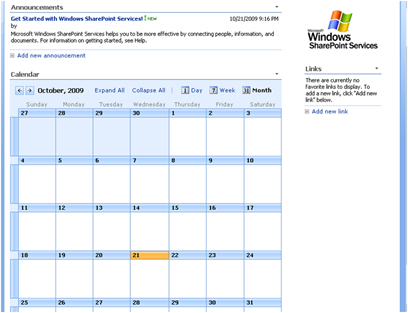
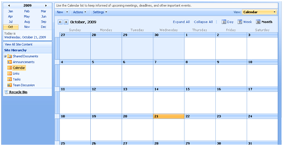
image This image is 742 pixels wide and forces the calendar view to be minimally that width. With the CSS below you can now hide that image and allow the calendar to fit within your team site with no problems at all. By making these changes you will not change the look of the full view of the calendar when you click on the event list. The screenshot below was taken with 1024x768 resolution.

image Here is the CSS:

.ms-calheader img{
display: none;
}

#CalViewTable12 img{
display: inline;
}

.ms-cal-nav-buttonsltr{
white-space: nowrap;
}

Full Calendar View with styles applied:

image

Enjoy!

Comments

Great tip! We'll be implementing this is all our themes. Cheers,
Kate
Anonymous said…
Great! That is what I was looking for. Thanks!

Popular posts from this blog

SharePoint 2010 Base CSS Classes

This will be the first of many SharePoint 2010 posts. I will be focusing on a few of the main CSS classes used for SharePoint 2010 Public Beta. As the product becomes more final there might be some changes to the class names but I will be sure to create a new post if that happens. This will be quite a lengthy but it should be helpful. The default CSS given below are just highlights of the full CSS attributes for that class. I will be using a basic team site as my base for the screenshots. Here is a basic structure of the main areas that I will cover. Ribbon Row Table Row Left Site Actions Navigate Up Edit Tab List Browse Page Table Row Right Give Feedback Welcome Menu Workspace Body Container Title Row Title

SharePoint 2010 Content Query for Blog Posts

I hope this post will help many of you feel comfortable with using the Content Query Web Part. In this post I will walk you through the process of creating a content query web part and configuring it to show custom field types. I will also give details on how to use XSLT to stylize and format the data being pulled. I will be using the following scenario as an example. Say that you had a site collection with a top level publishing site. This publishing site would display a the most recent blog posts from all blog sites within its own site collection. To solve this problem we will use a Content Query Web Part and a customized ItemStyle.xsl using XSLT. Please note that the “SharePoint Server Publishing Infrastructure” needs to be enabled at the site collection to display the content query web part. Step 1: Add a Content Query Web Part to Page Navigate to the site that you want the blog posts to show up and click on edit page. Under Editing Tools in the Ribbon, Click on

SharePoint 2013 Responsive Table Columns

I have been wanting to write this one for a while now. It is really amazing how UX is really finding is way into everything that we use and interact with. From Custom applications both mobile and on a desktop to document management or large data visualizations. There is always room for better usability and new concepts. SharePoint lists and library functionality really has not changed much for the past 10 years... I remember back in 2003 when I saw the same table/grid based views of documents and list items that exists in SharePoint 2013. But now we can look at them in a whole new way! In this video blog you will see how to create a responsive CSS table so that when the browser size is reduced it will hide specific columns. However hiding data is not always the right thing to do. What if a user needed those columns to filter on or to use for comparison to another document? Well that is where the custom jQuery Column chooser comes in. It allows you to see what columns are displ