Since SharePoint was first introduced in 2001its standard visual design appearance has taken on quite a few different forms over the years. The base core features of document management and collaboration have stayed pretty static but the introduction of publishing and social features has transformed the product into a Swiss Army knife and can be used for many different things.
Here is a look at its progress from 2001 all the way through 2013.
Microsoft SharePoint Portal Server 2001 
Core Features: Base included document management, search and what was called then a dashboard site to display webparts.
Visual Design: This was before my time but from the looks of it the design came with a standard header that you could customize the logo or title of the site.
Microsoft SharePoint Team Services 2002 
Core Features: Ability to create lists and HTML pages.
Visual Design: The design got a slight change to the header and also added in page level icons. It is also the first introduction of the left side navigation “Quick Launch”.
Microsoft Office SharePoint Portal Server 2003 
Features Added: In 2003 the Microsoft team added the ability to create “Topic” sites. These sites were a bit more complex than the webpart pages and were the first step towards the now publishing sites. The Search was also updated in this version.
Visual Design: The design got a major overhaul and it included many new design elements and a lot more CSS. Almost every page had a icon based on the type of site it was, however the search control was one of the hardest things to figure out how to customize correctly. They also figured out how to flip text vertically on the left side navigation…
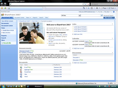
Microsoft Office SharePoint Server 2007 
Features Added: In 2007 they did another major overhaul with the ability to have publishing, master pages, and page layouts.
Visual Design: The design included a shaded background that framed in the content area. This allowed site owners to choose themes that drastically changed the look and feel of the sites. With the inclusion of the master pages designers no longer needed to modify the core CSS files on the server to customize the look of their sites.
Microsoft SharePoint Server 2010 
Features Added: There were not too many core features added between 2007 and 2010 other than the introduction to the SharePoint Ribbon and an enhanced profile and social features like the newsfeed.
Visual Design: As with the previous version the design for SharePoint 2010 got a complete overhaul for its master page. It got converted to a mostly all table less design. The design was simplified and some effort was put into site performance by including sprite images and less heavy background images.
Microsoft SharePoint Server 2013 Preview 
Features Added: The new features for 2013 focused on social connections, mobility, project management, communities, search, and apps.
Visual Design: The new metro inspired design is very simplistic and uses font weight and color to guide the users on the page. All colors are flat and the iconography is very simplistic and monotone. The introduction of the “Design Manager” will allow designers that don’t have any master page or page layout experience to customize the look of the sites by just using standard HTML and CSS.
SharePoint has definitely had an interesting design history and I think is going in the right direction. Yes the design is drastic but its just a shell for us to add our own flair. The design trend for what I have seen is hedging on the “Minimalistic” approach. Take for example Facebook, its easy on the eyes and people at first were mad because they could not customize the look of it, but now people don’t care about that. They just want to know what Mary Sue did on her last vacation or want to share with everyone that they going to see the next batman movie…
Overall I am very excited for our next branding adventure with SharePoint 2013 and will be sure to share my experiences, tips, tricks, Etc. with you all!
Comments
Hi ... william.. thanks for sharing information.This has to be one of my favorite posts! And on top of thats its also very helpful topic for newbies. Thanks a lot for informative information on sharepoint