SharePoint 2010 Themes

As you all know SharePoint has a new theme engine for 2010. You can do cool things such as create a theme in PowerPoint, export it and then import it into SharePoint 2010, click apply and you got a custom theme. One aspect that I could not find documented is the definition of when you choose a color for a particular element what is it really changing?

If you modify the theme for a site you can use the picker to choose a OOTB or custom theme. Or you have the ability to choose your own color scheme via the following elements.

image

My approach: Make each element white to start with and then one by one add color and document the results. Just for kicks here is what it looks like when it is completely white… (not a color scheme I would recommend…) I will be using a red color: #C12345 for testing.

image

Here are the details for each one of the elements above:

Text/Background- Dark 1 (41 Classes)

image

  • Page Title Hyperlink Text
  • Hover Text
  • VB Body Text
  • Site Action Menu Text
  • Left Navigation Links Text
  • Site Setting Page Text Headers

Text/Background - Light 1  (37 Classes)

image

  • Body Background
  • Toolbar Background
  • Quick Launch Borders
  • Web Part Header Background
  • Site Action Menu Background
  • Site Action/Welcome Text Color
  • Pop-Up Window Background

Text/Background - Dark 2  (43 Classes)

image

  • Top Banner Background
  • Left Navigation Header Text
  • Recycle Bin/View All Site Content Text
  • I Like/Tags Notes Text
  • Library Column Text
  • Site Action Drop Down Border
  • Breadcrumb Current Location Text
  • List Description Text

Text/Background - Light 2  (19 Classes)

image

image

  • Browse Tab and hover Background
  • Title Container Background
  • Top Links/Header 2 Background
  • Quick Launch Background
  • Web Part Adder Background

Accent 1  (10 Classes)

image

  • Quick Launch Hover Text
  • Top Link Selected Tab

Accent 2  (4 Classes)

image

  • .ms-error
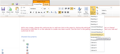
  • Rich Text Colored Heading 2 Text Styles

Accent 3  (9 Classes)

image

  • Rich Text “Caption” Style Text Color

Accent 4  (5 Classes)

image

  • Border Under Web Part Selector

Accent 5  (3 Classes)

image

  • Rich Text Colored Heading 4 Text Styles

Accent 6  (3 Classes)

image

  • Rich Text Highlight background color

Hyperlink  (12 Classes)

image

  • Toolbar Text Color
  • VB Body Hyperlink Text
  • a:link Class Text Color
  • Web Part Title Hyperlink Text (Not Visited)

Followed Hyperlink (2 Classes)

  • .ms-WPBody a:visited
  • a:visited

I hope this post will help you when you decide to create your own theme via the above elements. If you create your own theme you can simply view the source of the page and there will be a unique CSS style sheet reference “_themes/16/corev4-8digithex.css?ctag=#”. Just copy that url and past it to the end of your site string http://yoursitename.com/ and you can download the custom file.

Comments

Jeff said…
Thanks for taking the time and map out each of these
Unknown said…
Nice one.

am just trying to wokr out how i can leverage this Theme tool to help with my customisation.
Anonymous said…
Great job, very useful

Thx
Tiago Duarte said…
Do you have any trouble selecting fonts? No matter what font I choose for heading and body, no fonts seem to change on the page.
Unknown said…
Nice job, this is just what I've been looking for. Thank you for putting the time into this.
Anonymous said…
This is really helpful, I'm glad you did this. It's just what I was searching for. Thanks!
Markus said…
great job - thanks :-)
Anonymous said…
Very helpful. Thank you.
Anonymous said…
Am havin the same trouble pointed out by Tiago. The font change is not gettin reflected... :(
Anonymous said…
Hello,

Firstly I would like to congratulate you on the well-written blog!

We have now moved to SP2010 and have a couple of questions on colour schemes, themes etc.

1. Can we have different colour schemes for these different sites in a portal?

2. Can we have different shades of colours within the different sites?

Thank you,
Alkis
great work. and thanks for this blog
Anonymous said…
THANK YOU - I've been searching everywhere for this and was about to go through the same one color approach! Very helpful :)
Lee B said…
Thanks for this. Will save me time putting my themable master page together.
Anonymous said…
Thanks for the blog...it was very useful...i was searching for this....:)
Anita said…
Thanks for this post, exactly what I was looking for!
Vicki Thomas said…
Thank you so much - I also have been looking everywhere for this.
roma said…
nice!! very usefull
Unknown said…
This is a HUGE help! Thanks for doing this!
DB said…
Great article. Probably being really stupid here but how do you then save your custom theme as a .thmx for later use?
Anonymous said…
Great Job!!!
Anonymous said…
Excellent job. Exactly what we were looking for. Thanks for taking the time ...
Kevin Latham said…
Thank you for the elegant solution. I was working on this by brute force - color picking elements and comparing them to the theme colors.

I didn't see an entry for Colored Heading 1 in your list. I'm pretty sure it's based on Txt/Bkgd Light 2: the middle/medium shade.

Again, thank you. It was a generous contribution.

Kevin L.
Anonymous said…
beautiful,
Thanks for these fantastic resources
Here is a useful link about
SharePoint 2010 template
Anonymous said…
This article is very useful
We provide Sharepoint 2010 themes the best and cheapest for the Enterprise
Bala said…
I fllows your steps to copy the files tot the respective folders and did a reset on IIS. But the Pimmped theme didnt appear under the apply theme page. Could you please advice?
I am using SPS 2010 and copied the pimped forlder to 14 instead od 12 in MOSS2007.

Thanks
Nick
Bala said…
Hi, I tied it on 2010 bu the theme didnt appear under the apply theme page for the site. I copied the pimped folder to \14 instead of 12 meant for MOSS 2007. Please advise.

Thanks
Nick
mk said…
Thanks for this post. Here's all the SharePoint 2010 color themes with pictures: http://surfpointtech.com/2012/10/13/all-sharepoint-2010-color-themes-with-pictures/

Popular posts from this blog

SharePoint 2010 Base CSS Classes

This will be the first of many SharePoint 2010 posts. I will be focusing on a few of the main CSS classes used for SharePoint 2010 Public Beta. As the product becomes more final there might be some changes to the class names but I will be sure to create a new post if that happens. This will be quite a lengthy but it should be helpful. The default CSS given below are just highlights of the full CSS attributes for that class. I will be using a basic team site as my base for the screenshots. Here is a basic structure of the main areas that I will cover. Ribbon Row Table Row Left Site Actions Navigate Up Edit Tab List Browse Page Table Row Right Give Feedback Welcome Menu Workspace Body Container Title Row Title

SharePoint 2010 Content Query for Blog Posts

I hope this post will help many of you feel comfortable with using the Content Query Web Part. In this post I will walk you through the process of creating a content query web part and configuring it to show custom field types. I will also give details on how to use XSLT to stylize and format the data being pulled. I will be using the following scenario as an example. Say that you had a site collection with a top level publishing site. This publishing site would display a the most recent blog posts from all blog sites within its own site collection. To solve this problem we will use a Content Query Web Part and a customized ItemStyle.xsl using XSLT. Please note that the “SharePoint Server Publishing Infrastructure” needs to be enabled at the site collection to display the content query web part. Step 1: Add a Content Query Web Part to Page Navigate to the site that you want the blog posts to show up and click on edit page. Under Editing Tools in the Ribbon, Click on

SharePoint 2013 Responsive Table Columns

I have been wanting to write this one for a while now. It is really amazing how UX is really finding is way into everything that we use and interact with. From Custom applications both mobile and on a desktop to document management or large data visualizations. There is always room for better usability and new concepts. SharePoint lists and library functionality really has not changed much for the past 10 years... I remember back in 2003 when I saw the same table/grid based views of documents and list items that exists in SharePoint 2013. But now we can look at them in a whole new way! In this video blog you will see how to create a responsive CSS table so that when the browser size is reduced it will hide specific columns. However hiding data is not always the right thing to do. What if a user needed those columns to filter on or to use for comparison to another document? Well that is where the custom jQuery Column chooser comes in. It allows you to see what columns are displ